I wanted a very simple and elegant card, I wanted to make a visual statement. I wanted very little info on it: my phone number and my website.
For something like this the paper itself will have as much voice as the image. So I choose a 130# cold press watercolor paper. Cold press will have a little less texture than hot press, and have a beautiful feel in the hand!
This paper is a lovely light cream color and the ink is super black - it has a toile look with the design.
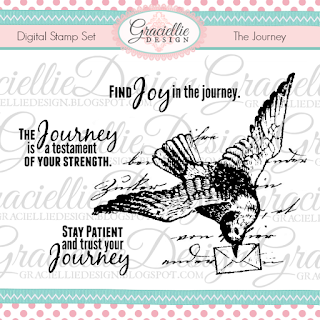
I choose "The Journey" set from Graciellie Designs Just a note here, these designs are meant for personal use and not commercial printing operations. If you are interested in a commercial license, contact Gracie!
I used a simple template in 'Publisher'
Back fielding through some of their color choices and using my own fonts
I created this simple black and white
business card:
on teh water color paper, it came out perfect (for me) This nice heavy weight will make it easy to find and the image will make it easy to remember!
I choose the swallow, you might like a beautiful flower or set of wings! With one of these beautiful images you can really make a statement about you!
Thanks for stopping by and Don't forget id you make a purchase from Graciellie Designs,
use the Ginny10 code for 10% off you order!
Ginny M


2 comments:
Thank you for sharing how you made this Ginny, and the info about the water colour paper is great.
Blessings
Maxine
Looks really great sis, a wonderfuf image to use for a calling card too.
Hugs Shaz.x
Post a Comment