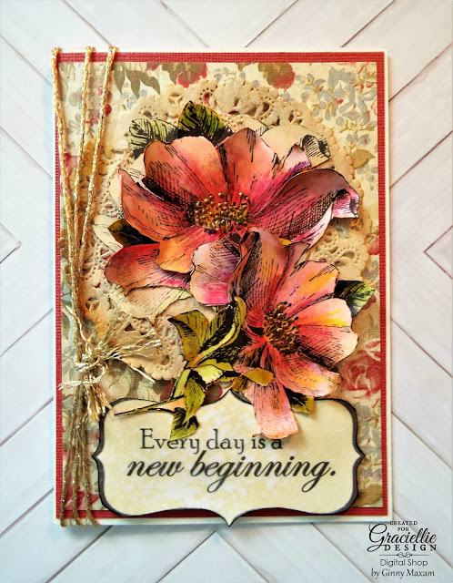
Here is the card, read on for How-to details!
Here is my set from Garciellie Designs
I wanted something vintage but not drab, The card needed to be cheerful!
I picked my papers and embellishments
This is my fancy ribbon storage system: a 13x14 sterilite drawer
I discovered something new in the paper world last week: the Paper Doily Store.
all of the doilies are hand died by the shop owner and everything is packaged so beautifully, I will be able to make a few cards just from the pretty packaging!
I pulled out my pens and I have started doing something new, maybe you already do this, but this is a first for me. I was testing the pen colors and decided what a great idea ( this is a tip) to create a swatch book of the colors I would be using for future reference. I love my markers but I do not love the colors, the colors are not well represented on the cap color code!
I wrote on the back of the swatch card the card and type of flower I colored with it.
I printed up my images on Neenah #80 solar white from Paper Temptress , changing the black default ink to a dark brown. A word on surfaces with coloring; The processing of paper changes as the need for medium acceptance changes. Much of what we use in the craft industry is a scale down from the commercial world. Long before Neenah Solar White was Neenah Soar Whtie for alcohol pen coloring it was one of the highest quality offset printing papers (. This paper goes through a rigorous process of surface polishing, That is why it is so smooth, It is made with a long grain pulp and that is why the ink does not feather on the paper. 80# is my favorite for printing and #110 for card base. It ha a beautiful appearance and "hand" or it feels good in your hand!!
I laid in my basic colors and then began to add detail with pencil
Here is another tip using AP and Pencil: I dip my pencils and blender pen right into blending solution AKA Denatured alcohol or you can use 90% rubbing alcohol. Works beautifully!
Bottom flowers are done much more simply:
And here is the finished card:
I hope you like my little coloring tutorials, like most things in lift practice helps!
Thanks for stopping by,
Every day is a new beginning!
Ginny M
This card has been entered into Simon Says Stamp Monday challenge: Handmade flowers


4 comments:
Beautiful. Thank you for the step by step tutorial.
gorgeous card ginny, thanks for sharing for tutorial
What a stunning card Ginny - and thank you for your tips and techniques
Blessings
Maxine
Lovely stamp images by our dear Gracie well done, Ginny, on your colour swatch too I do that and change them a little if need be, great creation.
Thanks for sharing your inspiration!
Shaz in Oz.x
{Calligraphy Cards - Shaz in Oz}
Post a Comment